Henrik Kubel
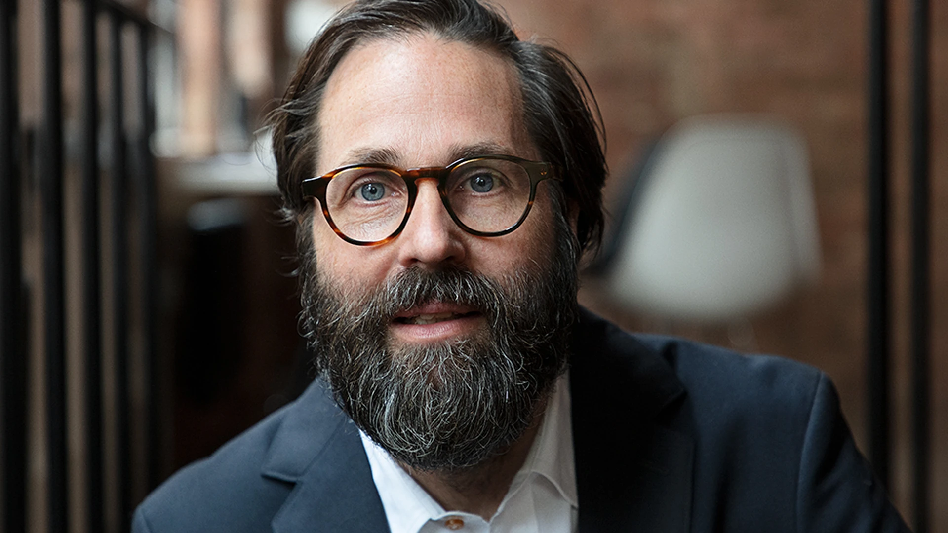
Henrik Kubel is a Danish type designer, living in London as of 2026. Co-founder of A2-TYPE Foundry.
Henrik Kubel graduated from Denmark’s Design School in 1997 and completed a postgraduate degree at the Royal College of Art, where he met Scott Williams; the two founded the design studio A2/SW/HK on graduating in 2000. A2-TYPE, their type foundry, came out of the studio a decade later. Kubel is the principal typeface designer there, and most of what the foundry publishes began as type drawn for a client job[†]TypeParis News - Q&A Henrik Kubel.
When A2/SW/HK started, the studio drew its own type for client work[†]TypeParis News - Q&A Henrik Kubel. Over years of commissions, that built up a body of type that eventually became the A2-TYPE catalog. The Independent typeface family is one example of what that produces. Drawn by the studio in 2013 for The Independent newspaper’s print and digital editions[†]A2-TYPE - Independent Typeface, it covers the full range of newspaper typesetting: a text serif, a sans, and a headline cut for display, with slab and stencil extensions added to the family later[†]A2-TYPE - Independent Typeface. A newspaper typeface has to hold in body copy at small sizes and scale to front-page headlines. The family does both. It won a D&AD Yellow Pencil in 2014 and the typeface design prize at the Tokyo Type Directors Club in 2015[†]A2-TYPE - Independent Typeface.
During his career, Kubel has worked with Margaret Calvert more than once. Calvert is one of the designers behind the typefaces and pictograms on Britain’s road and rail signs. Kubel is described in the monograph on Calvert’s career as her frequent creative partner and a former student[†]DesignWeek - Beyond the signs: Margaret Calvert.
New Rail Alphabet, released in 2009, was a refresh and expansion of Calvert’s original alphabet from the 1960s, which had been in use with British Rail, BAA, and the NHS. Later came Moscow Sans, a wayfinding typeface for Moscow’s public transport network, developed by Kubel and Calvert together. It covers two scripts, Latin and Cyrillic, with the Cyrillic drawn alongside Russian typeface designer Ilya Ruderman, and a system of more than 40 pictograms for the network. The pilot launched in 2015[†]DesignWeek - UK consultancies work on new wayfinding for Moscow public transport.
More recently, Kubel collaborated with Calvert and Neville Brody on Calvert Brody, a headline typeface for the Royal College of Art[†]DesignWeek - Royal College of Art rolls out new identity. Rail Alphabet 2, another typeface from that collaboration, appears on the UK’s new Rail Clock at London Bridge Station, designed by Design Bridge and Partners for Network Rail[†]DesignWeek - “Excellent ordinary” – how the UK’s new Rail Clock was designed.
Some of A2-TYPE’s catalog came out of gallery and museum commissions. Flavin was drawn for the Dan Flavin retrospective at the Hayward Gallery in London in 2006: a rounded sans whose form echoes the shape of a fluorescent tube light[†]A2-TYPE - Flavin. Glyptotek is a revival of lettering on the facade of the Ny Carlsberg Glyptotek museum in Copenhagen, a building from the early 1880s. The original lettering pairs serif uppercase with sans serif lowercase, a combination the revival carries across three variants[†]A2-TYPE - Glyptotek. Aveny-T began in 2000 as a capitals-only poster typeface for a Danish theatre, then expanded into a full family with lowercase and additional weights[†]A2-TYPE - Aventy-T. Game Over is a pixel typeface for low-resolution screens, built around 8-bit video game typography[†]A2-TYPE - Game Over.
Afterall Serif was drawn by Kubel for A2/SW/HK’s identity redesign for the Afterall Research Centre at Central Saint Martins in London. It’s a text typeface that holds well at body sizes and has more to show when set large: unusual ligatures and open forms in several of the capitals. The Afterall Serif article here covers it in more details.
A2-TYPE’s work has won at D&AD, TDC New York, and the Tokyo Type Directors Club. Kubel has received a three-year working grant from the Danish Art Foundation and the Knud V Engelhardt Award from the Danish Museum of Art & Design[†]Alliance Graphique Internationale. He’s been president of the AGI’s UK chapter and taught typography at the Royal College of Art. After the RCA degree, he kept studying: diplomas in typeface design at Cooper Union in New York, the Plantin Moretus Museum in Antwerp, and the University of Reading[†]TypeParis News - Q&A Henrik Kubel.
New Perspectives in Typography, co-authored by Kubel and Williams under the A2/SW/HK name, covers over 100 designers in a survey of contemporary typographic design, with essays on where the discipline has been and where it’s going[†]Amazon - `New Perspectives in Typography` book description.
The full A2-TYPE catalog, with trials and licensing, is at a2-type.co.uk. The foundry sells exclusively through its own site[†]TypeParis News - Q&A Henrik Kubel.