Afterall - Words About the Logo
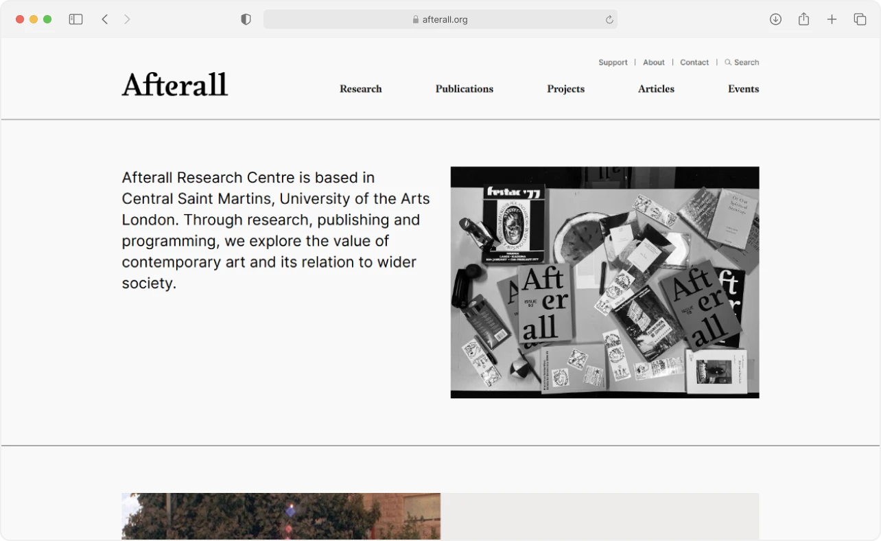
Afterall Research Centre, based at Central Saint Martins in London, and the organization's identity redesign by A2/SW/HK.
Fonts are cool. Some more than others. But custom ones are in a league of their own, built for one brand's needs and no one else's.
Commission one and the licensing is usually simpler: you're paying for the work, not the usage. Print, digital, identity. It's all covered.
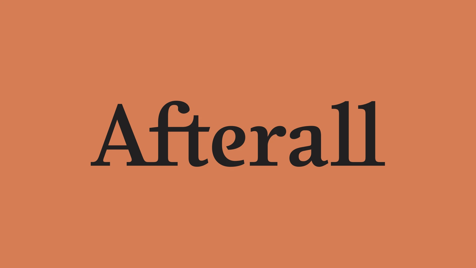
Take the Afterall logo. It's set in Afterall Serif, their own custom typeface, with one edit on top: the A and the f are joined in a way the typeface doesn't produce on its own.
Afterall is a research center at Central Saint Martins in London[†]Afterall — About, and when A2/SW/HK redesigned the organization’s identity, Henrik Kubel drew a custom serif typeface for it, released through A2-TYPE Foundry[†]A2-TYPE — Afterall Serif. Afterall Serif is what the site uses for headings and navigation, as well as what the logo is set in.
Set Afterall in Afterall Serif and you’re most of the way to the logo already. A typeface built for one brand becomes the face of it.
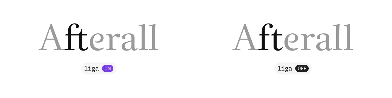
The f and t are a natural pairing for a ligature: the crossbar of the f extends right toward the t’s stem. Set as two separate shapes, they’d be bumping into each other. A ligature replaces both with a single drawn glyph, one where the overlap is part of the design. In the logo, the crossbar of the f runs straight across into the stroke of the t, making ft a single connected shape. It comes from Afterall Serif itself, from the liga feature (the standard ligatures, the pairs that come on by default).
You can try Afterall Serif in A2-TYPE’s type tester. A few other fun pairs to try there: fi, ff, fl.
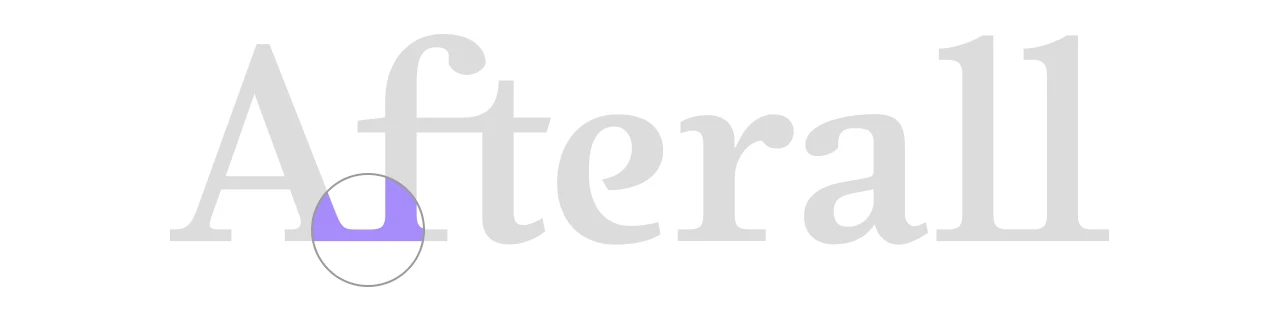
The logo also has a connection between the capital A and the lowercase f, though calling it a ligature isn’t quite right. A ligature is a feature of the font that appears during text rendering. This is not the case here: in this case, it looks like the serifs might have been moved closer together and the connection between them has been manually adjusted.
The serif on the foot of the A and the serif on the f touch, close enough that Aft reads as one connected group. It looks enough like a dlig (the discretionary ligatures, optional pairs you turn on when you want them) that I keep wondering if it was part of an internal version of Afterall Serif, one that was never made public. But there’s no way to verify it, so take it with a bit of salt.
So the ft ligature is an OpenType feature doing what it was built to do. The Af contact is something else: added to the set word, separate from anything the public release of Afterall Serif produces.