The Magic Oyster Tour's 2025 T-shirts
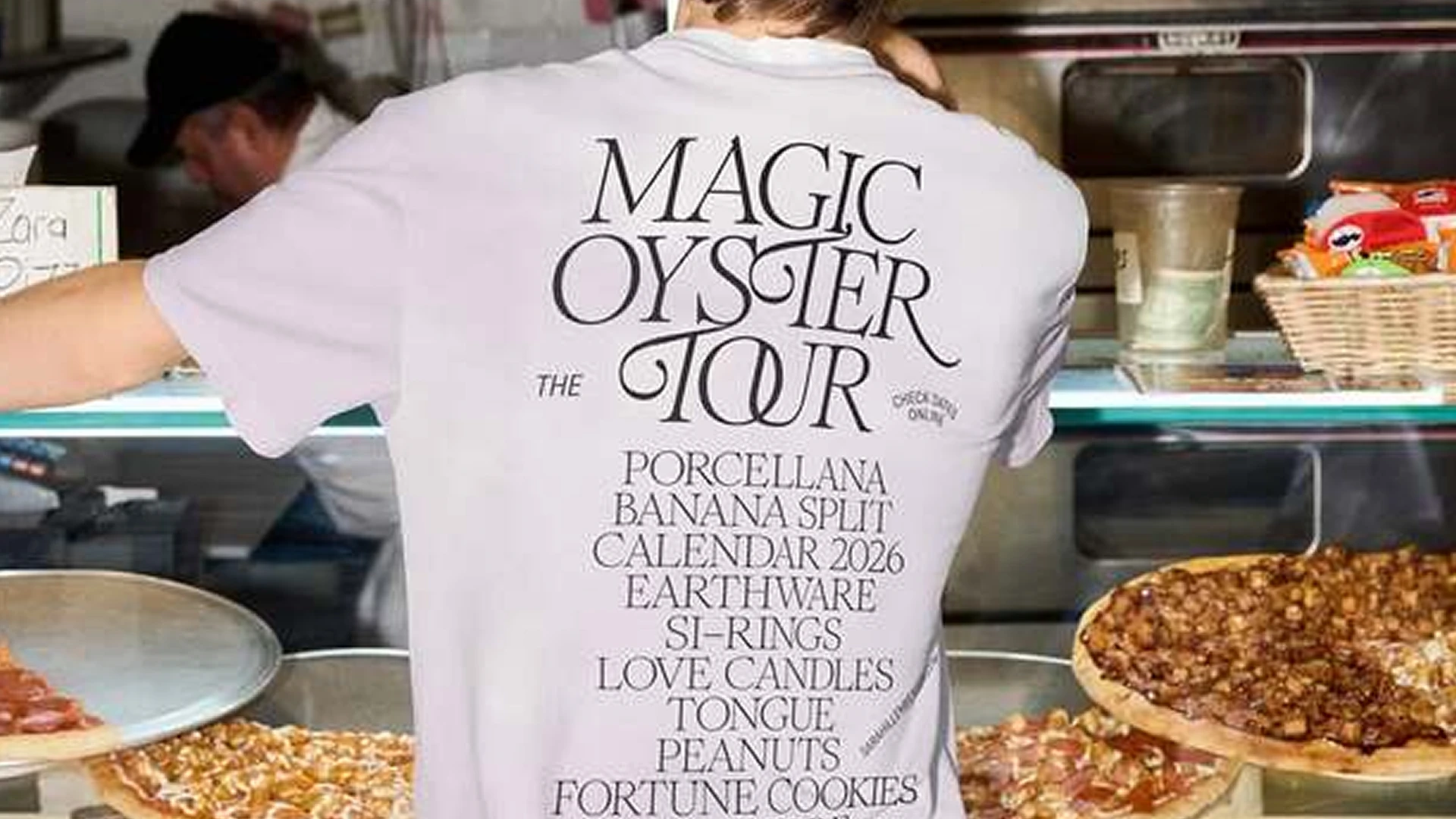
Herburg Weiland set The Magic Oyster Tour in Romie Italic, using two swash alternates and an OU ligature in the headline, and nothing else.
The Magic Oyster Tour is a series of holiday pop-up events Sara Hillenberger organizes in Germany: ceramics, clothing, objects, and more. On the back of the shirts, MAGIC OYSTER TOUR sits at the top in Romie Italic, and below it, in Romie Roman, a list of what I'd assume is on offer at the events. With no supporting imagery, the type does all the work here.
That type is Romie, drawn by Margot Lévêque and published through Claude Type. Herburg Weiland paired it with GT America Condensed from Grilli Type. Three words, stacked one on top of the other: swash alternates on the T in OYSTER and TOUR, and the R in OYSTER only, plus an OU ligature in TOUR that you don't see often. Romie's italic has a full set of optional features, but the design uses just two of them; the headline reads as considered rather than busy.
The Swashes in Romie Italic
Romie’s italic comes with optional swash alternates for a range of characters. The Claude Type website has a type tester — write something with some drama to it, then hit the “SWASHES” button. It’s easy to spend more time there than you planned. In The Magic Oyster Tour, two characters get swash forms: the T, in both OYSTER and TOUR, and the R in OYSTER only.
The swash T’s crossbar angles down to the left, unlike the horizontal crossbar of the roman. In OYSTER, it reaches back toward the spur of the S that precedes it, and with MAGIC stacked directly above, the crossbar also lines up with the I in MAGIC. In TOUR, something similar: the crossbar merges into the spine of the S in OYSTER above it. The terminal of the crossbar appears to have been removed: a manual edit so the two strokes meet rather than collide.
The swash R in OYSTER has a long, angled leg that extends well past the right edge of the word, adding too much white space on that side. The R in TOUR stays plain. Herburg Weiland appears to have aligned the three words optically: centering by the letterforms alone, ignoring the swash, keeps the composition balanced. Factoring in the full extent of the swash would have made OYSTER appear to lean left.
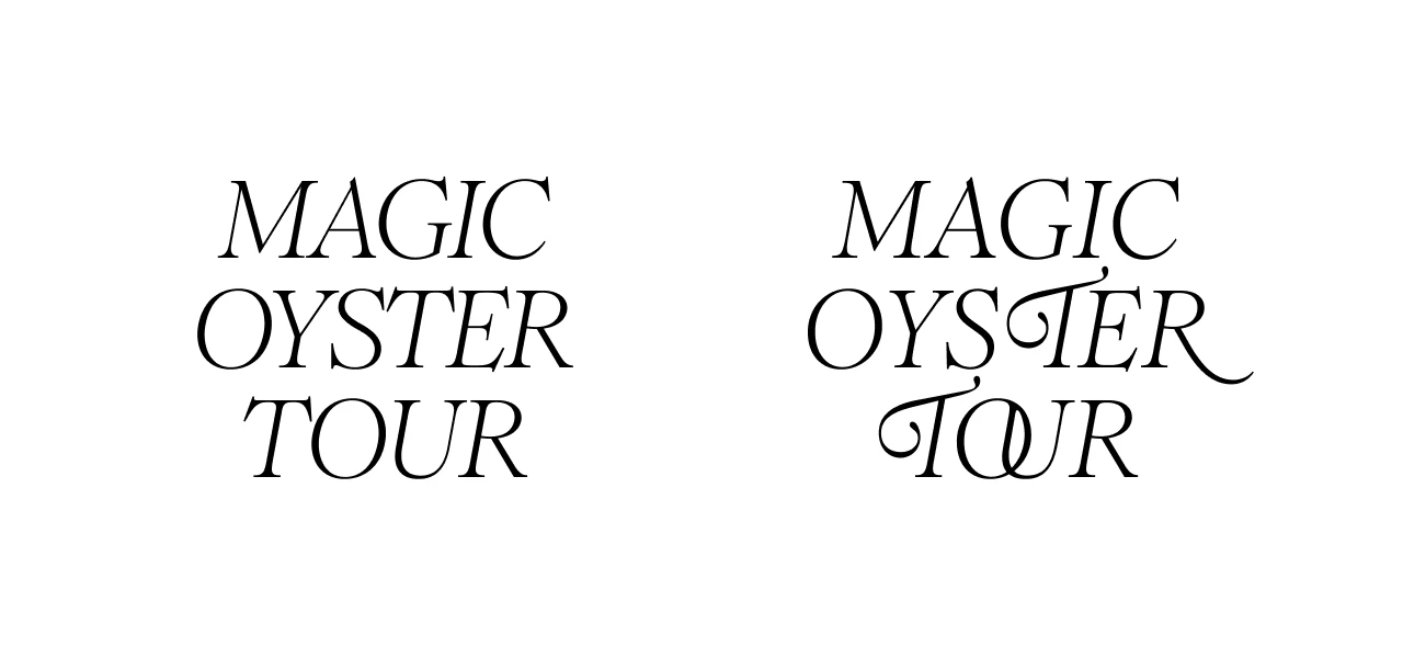
Of all the swash alternates Romie offers, the design uses just two. The R in TOUR doesn’t get one, and nothing in MAGIC does either. TOUR already has two things going on: the OU ligature and the swash T. A swash R on top of that would have added too much visual weight to a four-letter word. The choices are spread across the three stacked words rather than concentrated in any one of them.
The OU Ligature
In TOUR, the U’s left stem runs inside the O’s closed counter. At this size, you can see it. The word probably works without it, but I find the ligature gives TOUR a reason to be looked at. Four letters, the shortest in the stack.
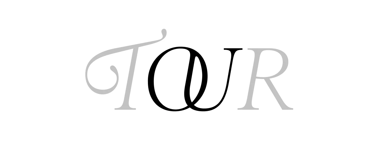
The type tester on the Claude Type website calls it “LIGATURES,” but from what I found in the CSS — not my natural habitat — it appears to sit in ss11. I wasn’t able to verify this against the full released font file.
There are other connections in the headline that are easier to miss — and I’ll be honest, I did miss them at first. In MAGIC, the serifs of M and A have been pushed together until they touch. Same in TOUR, between U and R. Romie doesn’t produce these on its own: it looks like very tight letterspacing for those pairs, or the letters were manually nudged closer and the serifs adjusted so they make contact cleanly rather than colliding.
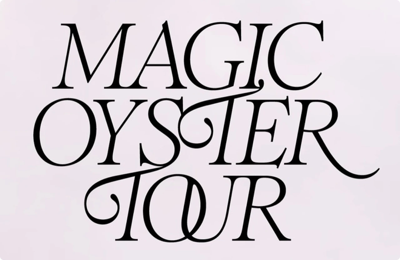
While the MA and UR contacts are something you’d walk right past, the OU ligature makes sure you spot it — might be the unusual pair, might be the way the stem disappears inside the counter. Once I noticed all of it, the headline started reading as more deliberate than I’d given it credit for. You can add personality to a typographic composition in ways that don’t shout for attention, and sometimes those are the better choices.