Romie with Italics
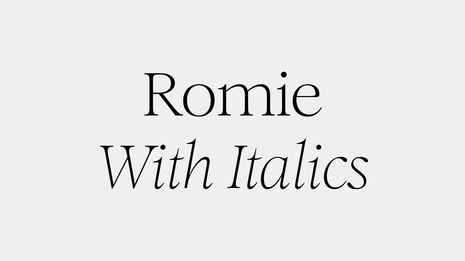
Romie, drawn by Margot Lévêque and published by Claude Type, her own type foundry. A 12-style calligraphic serif with swash alternates and a ligature set in the italic.
Romie started all the way back in 2017, when Margot Lévêque, unable to find the Garamond-adjacent serif she was looking for, drew her own. The complete family arrived in June 2024 after several years of expansion: six uprights and six true italic companions, mastered and produced by José Solé, published through Claude Type, her own type foundry.
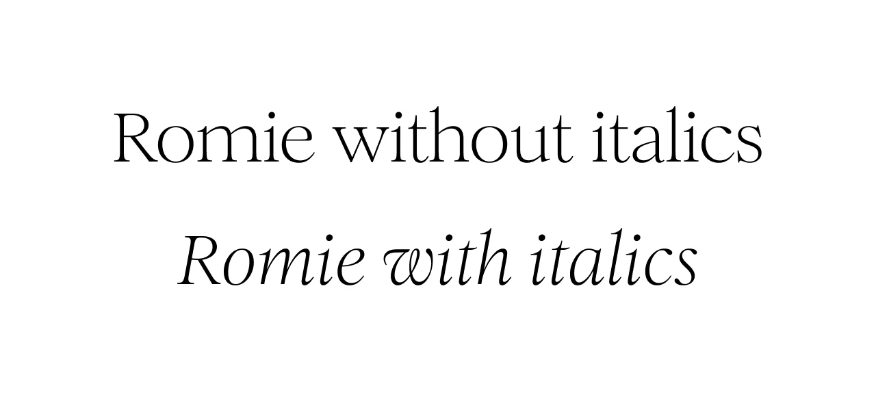
The italic is where the typeface gets to show its personality through the swash alternates and the ligature set.
Calligraphic Origins
The Claude Type description names Lubalin and Bookman as reference points, which gives you a good idea of what to expect from Romie: substantial serifs, a clear thick-thin contrast, warm forms[†]Claude Type — Romie. The calligraphic character shows in both roman and italic, though it amplifies in the italic.
The roman covers six weights from Light to Heavy. At text sizes it settles into the page cleanly; set it larger and the stroke quality comes through more clearly.
The italic is set at a 10.4° angle[†]Claude Type — Romie and carries the swash alternates. You can check the type tester on Claude Type to see the ligatures in both the roman and italic version of Romie.
The Feature Set
The roman’s trial font lists no stylistic sets: its features cover fractions (frac), subscripts and scientific inferiors (subs, sinf), superscripts and numerator/denominator figures (sups, numr, dnom), and ordinals (ordn). The Claude Type type tester shows ligatures in the roman as well, though they don’t appear in the trial’s feature list.
The italic adds ss01, ss05, and ss06. The Claude Type type tester surfaces these as two toggles, “SWASHES” and “LIGATURES.”
“SWASHES” activates ss01: optional alternate forms across a range of italic characters. You already know about the swashes in T and R, but the lowercase alternates are nothing short of a good reason to open the type tester and play around with your favorite words.
The “LIGATURES” toggle activates what the Fonts in Use entry for Romie calls the “mythical large ligatures set,” added in 2022[†]Fonts in Use — Romie. The OU ligature is the one to look at first: the U’s left stem nests inside the closed counter of the O. An unusual pair, and I can’t keep my mind off of it.
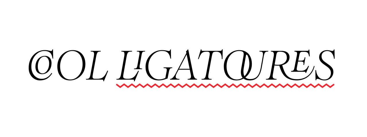
On the feature tags: the Claude Type type tester applies ss11 for “LIGATURES” per DevTools inspection. The trial font’s italic lists only ss01, ss05, and ss06 — no ss11. Do with that as you will.
The family covers 2,013 glyphs[†]Claude Type — Romie across Western European, Central European, Turkish, Baltic, and Vietnamese. The full type tester, with both toggles, is at Claude Type’s site.
The full character set, type tester, and licensing are at Claude Type’s website.