Afterall Serif
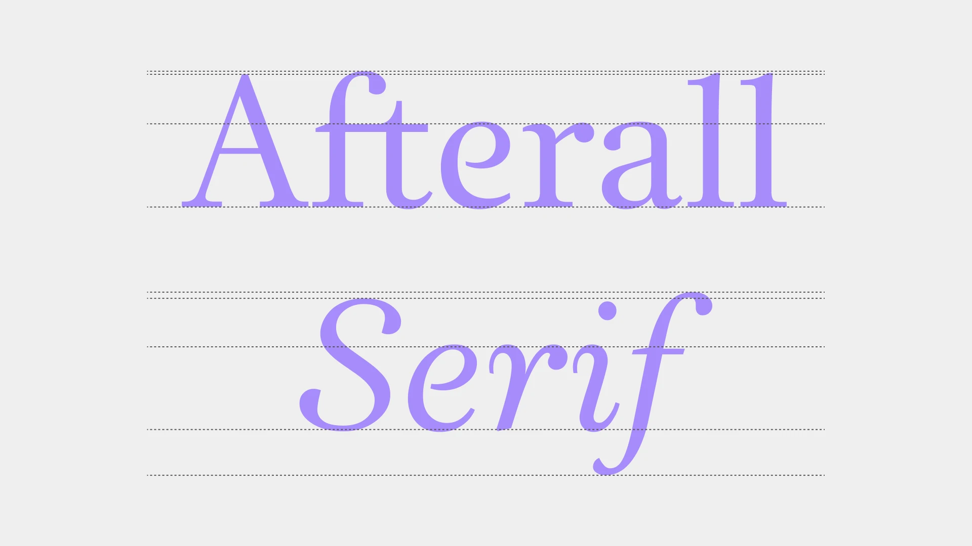
Afterall Serif, drawn by Henrik Kubel as part of A2/SW/HK's identity redesign for Afterall Research Centre. Published by A2-TYPE.
Afterall Serif was drawn by Henrik Kubel as part of A2/SW/HK's identity redesign for the Afterall Research Centre in London. Designed primarily as a text typeface, for long-form reading, it does that job well at paragraph sizes. Set it larger and the typeface gets to show more of itself.
Roman & Italic
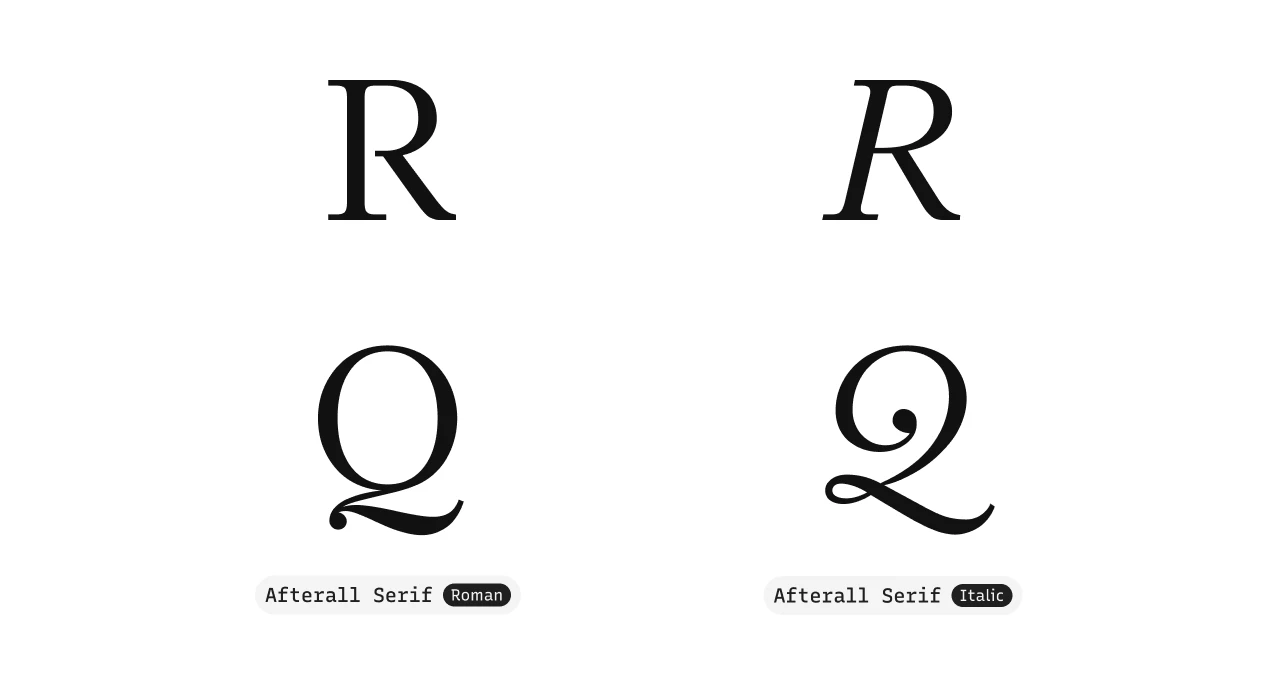
In the roman, set it big and a few things come forward. The shoulder and leg of the capital R don’t close to the stem, leaving the counter open where most serifs would seal it. The P does the same, its bowl stopping short of the vertical stroke and leaving the shape open at the bottom. The e has an open aperture too, its bar not closing against the curved stroke on the right. The same choice runs through all three, repeated enough to read as character rather than coincidence.
The italic is a true italic, not a slanted roman. The Q changes the most: the closed round bowl of the roman opens into a single calligraphic stroke in italic, a shape that barely resembles the roman version. Some of the openness from the roman carries across. The P and e stay open in italic. The R is the exception, its gap closing in italic, the shape becoming a conventional one. The difference is clearest when you set both versions next to each other.
OpenType Feature Set
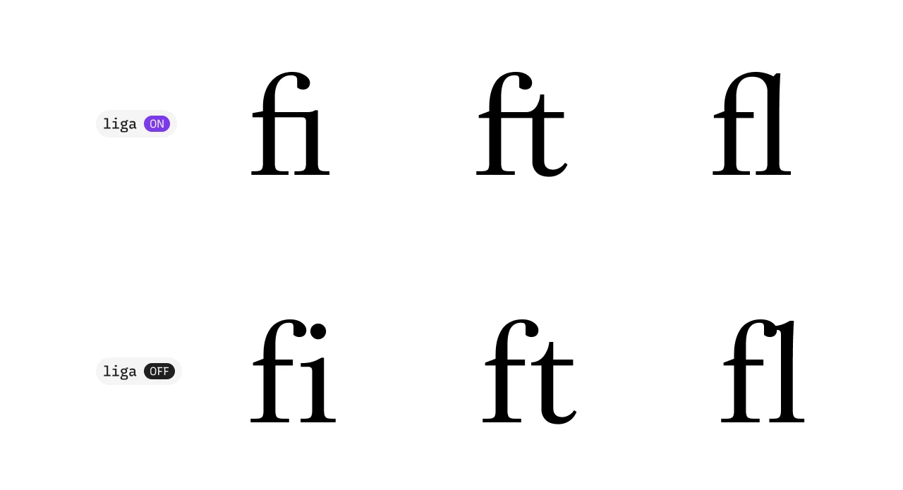
The typeface carries standard ligatures under liga, the pairs that come on by default in most text-setting software. For Afterall Serif, those are ft, fi, ff, fl, ffi, and ffl. The ft is the same one used in the Afterall logo. All six pairs can be tried in A2-TYPE’s type tester here.
The published type specimen has more: additional ligature forms for si, gi, ct, and st under dlig (the discretionary ligatures), the optional pairs you switch on when you want them. Worth pulling the specimen up if any of those pairs caught your eye, or licensing Afterall Serif and using them in your work.
The character set includes three figure variants. The default figures are lining, sitting from the baseline to cap height, proportionally spaced. With tnum (tabular numerals) active, the spacing becomes monospaced, keeping numbers in a column aligned. With onum (oldstyle numerals) active, the shapes change: 3, 4, 5, 7, and 9 drop slightly below the baseline, while the rest hold at their usual height. You can see all three in the character set on A2-TYPE’s Afterall Serif page. Hover over any figure to see which variant it is.
The character set runs to 497 glyphs and covers Latin script across a wide language range, including Romanian, Turkish, Polish, and Swahili, among many others. The set also includes subscripts, numerators, denominators, and a collection of ornamentals. A few things you wouldn’t expect: the A2-TYPE logotype as a glyph, and the florin, ƒ, the old currency mark built on a hooked f.
The full character set, type tester, and licensing are at A2-TYPE’s site.